UI/UX case study · Independent concept
A clearer route through a difficult situation.
A law-firm website and bankruptcy intake concept. The design separates people seeking advice from creditors, former employees and landlords who need to act on an existing case.
- My role
- Website review · User flows · UI · Front-end
- Deliverable
- Website + intake portal prototype
- Project status
- Self-initiated · Not commissioned
This is an independent design study. The firm has not commissioned or approved it. The prototype demonstrates an interface; it is not the firm's live service.
Explore the working prototype ↗01 / Problem
One website, very different reasons to visit.
The project notes identified bankruptcy administration as a central part of this Uppsala firm's work. That suggested a task-focused design brief: help affected people find the right information and route. I did not have internal call volumes, inbox data or evidence that the site was losing clients.
Evidence: recorded observations from the original website review in the project notes. These describe that review, not a fresh audit of the firm's current site. The design implications below are my interpretation.
Zoom restricted
The original review recorded user-scalable=0 in the viewport configuration.
Design requirement: Allow zoom and preserve a readable, usable layout on a narrow screen.
Broken interaction
The notes record five share controls on news posts pointing to '#'.
Design requirement: Use working actions with a clear purpose; remove controls that do nothing.
Different service tasks
The public material and prototype distinguish claims, employment-related questions and landlord or asset enquiries.
Design requirement: Offer situation-based entry points, with case context retained through the journey.
How might someone affected by a bankruptcy find the relevant route, understand what to prepare and know what happens next?
02 / People & requirements
Start with the task someone needs to finish.
These are provisional user profiles inferred from the services and public content. They are working hypotheses, not personas validated by interviews. No user interviews or moderated usability tests are documented for this concept.
Creditor
Find the right case for an unpaid invoice.
A recognisable case, a claim route and clear requirements for supporting information.
Former employee
Understand where an employment-related question belongs.
Plain-language guidance and a dedicated route without unrelated claim fields.
Landlord or asset buyer
Contact the person responsible for a property or asset question.
Case context and a route separate from a general request for legal advice.
The information architecture has two entrances: legal advice and bankruptcy matters. The portal is a front-end demonstration. Real receiving, secure file handling, case routing and legal review are implementation requirements, not completed backend features.
03 / User flows
Route by the person's situation.
The prototype offers three routes from the portal. The claim flow below includes the demonstrated receipt as an intended endpoint. The wireframe adds a review step as a proposed improvement, so it is labelled separately from the existing UI.
Creditor: submit a claim
- Choose the claim route
- Select the bankruptcy case
- Enter claim & supporting details
- See a demo receipt
If the company is missing from the list, provide a way to identify it and ask for help. No real claim is received by this prototype.
Former employee: find the relevant guidance
- Choose the employee route
- Identify the case
- Read what to prepare
- Use the case contact route
Avoid asking the visitor to interpret legal eligibility. The firm must approve all guidance and the receiving process.
Landlord or buyer: ask about a property or asset
- Choose the landlord / assets route
- Identify the case
- Describe the matter
- Reach the relevant contact
If the visitor cannot identify a case, keep a clearly explained general contact route available.
04 / Wireframes
Structure before visual detail.
Retrospective wireframes, redrawn for this case study to explain the prototype's hierarchy. These are annotated structure diagrams, not original research artefacts or screens from a Figma file.
05 / UI decisions
The interface, and the reason behind it.
Separate advice from administration
Two homepage entrances give prospective clients and people with an existing matter different starting points.
Use progressive structure
The claim interface groups case selection, contact details, claim information and supporting documents. The aim is to reduce ambiguity; completion rates have not been measured.
Carry case context
Case cards, stage labels and a named contact give the journey context. Routing is demonstrated in the interface; a real integration still needs to be built and tested.
Preserve a clear prototype boundary
The concept displays a disclaimer and explains that forms do not deliver to the firm. Legal copy remains subject to the firm's review; reusing public text does not establish legal approval.
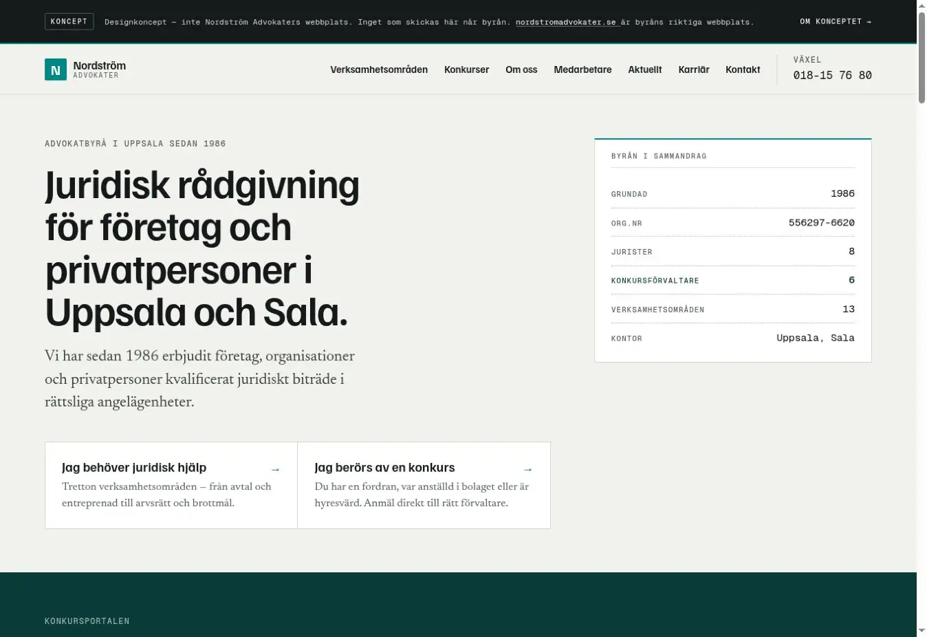
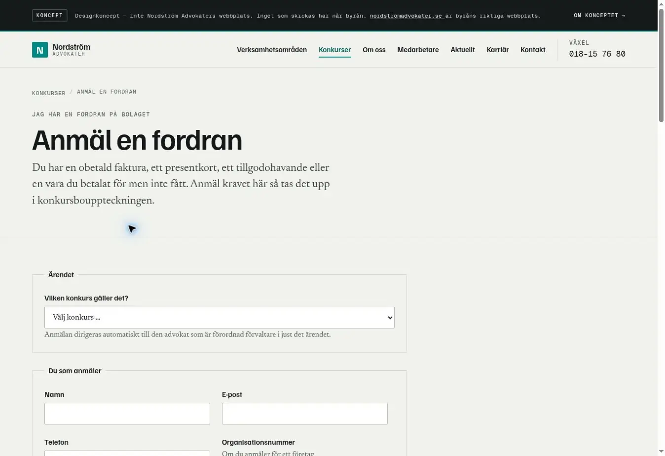
Actual screenshots of the working concept. Open an image to inspect it at full size.
06 / Validation
What exists. What still needs testing.
The output is a working front-end concept. There is no client launch, user-test result or measured conversion uplift to report. The following is a validation plan, not a list of completed tests.
Task-based usability sessions
Recruit five participants across the three provisional profiles. Use fictional cases and data. Ask them to choose a route, find a case and explain the next step. Record wrong paths, completion and hesitation.
Failure and recovery
Test a missing case, incomplete fields, invalid email, rejected attachment and network failure before launch. Preserve entered information and distinguish a failed submission from a receipt.
Operational outcomes
With the firm, establish a baseline for correctly routed enquiries and time spent clarifying missing details. Compare after launch. Fewer routine calls is a hypothesis, not a result of this concept.
Design takeaway
The commercial question changes the design brief. A law firm's site may support ongoing work as well as attract enquiries. Here, identifying the task led to a more useful structure than a purely visual refresh.
Before a real launch
Validate the provisional profiles with real users and staff, have the firm review the legal content, reduce unnecessary fields, add a review step, and implement secure receiving and case routing. The prototype is not a functioning legal intake service.
A similar challenge on your website?
I can review the route from a visitor's question to the next useful step. A 20-minute conversation is enough to identify the first priorities and discuss scope.