UI/UX case study · Independent concept
From an audit firm's credentials to a clear next step.
A responsive homepage concept for an audit and accountancy firm in Uppsala. The design connects three decisions: understand the service, assess the people and start a conversation.
- My role
- Website review · UX structure · UI · HTML/CSS
- Deliverable
- Responsive homepage prototype
- Project status
- Self-initiated · Not commissioned
This is an independent design study. The firm has not commissioned or approved it. The prototype demonstrates an interface; it is not the firm's live service.
Explore the working prototype ↗01 / Problem
The useful information was difficult to use.
The original review recorded practical obstacles on a Swedish accountancy firm's website: a fixed-width layout, conflicting history statements and contact details that were awkward on a phone. I used the firm's existing content to explore a clearer enquiry journey. I did not have access to analytics, customer interviews or enquiry records.
Evidence: recorded observations from the original website review in the project notes. These describe that review, not a fresh audit of the firm's current site. The design implications below are my interpretation.
A mobile barrier
The review noted a fixed-width layout and a phone number rendered as plain text.
Design requirement: Let content reflow on a phone and make the telephone action a real link.
Conflicting proof
The homepage said '50 years'; the services page said 'just over 30 years'.
Design requirement: Use one consistent history statement, with the date confirmed by the firm before publication.
Weak document structure
The notes record no homepage H1 and an English language attribute on Swedish pages.
Design requirement: Use a meaningful heading hierarchy and declare the language correctly.
How might a business owner understand the firm's relevance and find a person to contact without fighting the mobile layout?
02 / People & requirements
Start with the task someone needs to finish.
These are provisional user profiles inferred from the services and public content. They are working hypotheses, not personas validated by interviews. No user interviews or moderated usability tests are documented for this concept.
Owner comparing firms
Decide whether this firm can help my business.
Service descriptions, credible experience and a clear first conversation.
Existing client
Find the person or number I already need.
A short route to team and contact details, without rereading the sales pitch.
Firm administrator
Keep the information consistent.
One source for history, service wording and contact information.
Scope: a homepage concept, using existing Swedish content and a restrained visual direction. Team details, history and any proposed service or pricing wording need the firm's approval. This study does not establish how the firm actually prices its work.
03 / User flows
Two visits, two useful routes.
The information architecture groups the homepage into introduction, services, experience, team and contact. The main enquiry route and the returning-client shortcut are mapped below. Open each route to inspect it.
New visitor: assess fit and enquire
- Understand the offer
- Explore a relevant service
- Check experience & team
- Choose phone or enquiry
If the visitor is unsure which service fits, the contact option stays available; choosing a service should not be mandatory.
Returning client: reach a person
- Open the homepage
- Go to team or contact
- Choose the right person
- Call or write
Keep contact details readable and usable even if JavaScript is unavailable. Sending an enquiry is not evidence of a booked meeting.
04 / Wireframes
Structure before visual detail.
Retrospective wireframes, redrawn for this case study to explain the prototype's hierarchy. These are annotated structure diagrams, not original research artefacts or screens from a Figma file.
05 / UI decisions
The interface, and the reason behind it.
Keep the firm's language
Existing Swedish copy provided the starting point. Proposed edits clarify hierarchy and consistency; they do not invent a new service offer.
Make credibility legible
Navy, white, a restrained purple accent and a vector mark support a conservative identity. Evidence and contact details carry the trust argument.
Make the mobile action usable
Responsive sections and tap-to-call links address a concrete obstacle from the review. The effect on enquiries still needs measurement.
Keep the concept boundary visible
The work is presented as an independent prototype. Approval of company details, recipient routing and form behaviour belongs in a real launch process.
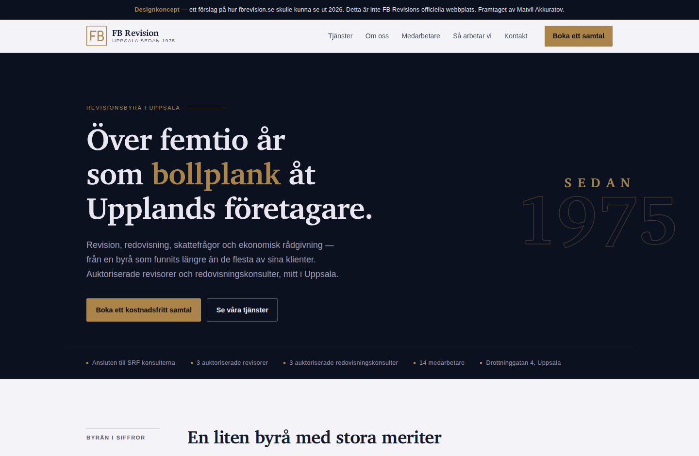
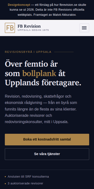
Actual screenshots of the working concept. Open an image to inspect it at full size.
06 / Validation
What exists. What still needs testing.
The output is a working front-end concept. There is no client launch, user-test result or measured conversion uplift to report. The following is a validation plan, not a list of completed tests.
Find and explain
Recruit five representative business owners. Ask what the firm offers and how they would contact it. Record wrong turns, hesitation and unassisted completion; revise where confusion repeats.
Use it on a phone
Check reflow, zoom, keyboard focus, link names and form labels. Test both the new enquiry and returning-client routes, including missing or invalid form input.
Measure after launch
With an agreed baseline, compare qualified enquiries and completed contact actions across comparable periods. Separate traffic changes from design changes; do not infer success from time on page alone.
Design takeaway
A specific inconsistency is a stronger design starting point than 'the site looks dated'. Here, content reliability and access to contact information matter as much as the visual treatment.
Before a real launch
Confirm the content with the firm, test the enquiry route with users, agree who receives each message, and validate a real form integration. No enquiry or conversion improvement has been measured.
A similar challenge on your website?
I can review the route from a visitor's question to the next useful step. A 20-minute conversation is enough to identify the first priorities and discuss scope.